TL;DR I’m Not a Racist – S42:E6 Durham COVID Update
Hey Y’all
As a white man I’m sorry I haven’t poured my heart out yet on social media to tell you about my personal experiences with racism and proved to everyone how “I’m not a racist.” But I couldn’t help myself, so, here goes…
Trigger Warning:
- Snarkiness
- Actual Facts
- Unqualified Assumptions
I just want to say a few things… First of all we went to the streets last night and stayed long enough for a white girl to get up and make a tearful speech that sounded a lot like my buddy who used to always get drunk and make the “I love you guys” speech. She never exactly said “you people” but she certainly said y’all a lot when referring to black folx. White people, if you can’t shut the fuck up, at least try not to be a cliche… Quit blabbering and do the work.
That said, I’d like to point out some data that’s available here in Durham and some of my (not especially informed but possibly relevant) reflections on it. (that’s the white man in me making sure to center himself in the conversation) Here are some charts reflecting COVID-19 data from Durham, NC. Because, let’s not forget, that while we are continuing with a much needed and righteous insurrection we are also still at the beginning of a deadly pandemic that is inordinately affecting the same people who are overwhelmingly affected by police violence and all the other systemic inequities in all the other systems.
Durham prides itself on being inclusive and celebrating diversity, and race has always been a central theme in everything Durham (not always in a gentle way) but even a bunch of rich liberal “progressives” cannot escape the system that perpetuates inequity…
Here is a graphic on the Durham Public Health Department’s web page. The Header says, “Locate a Testing Facility Near You”
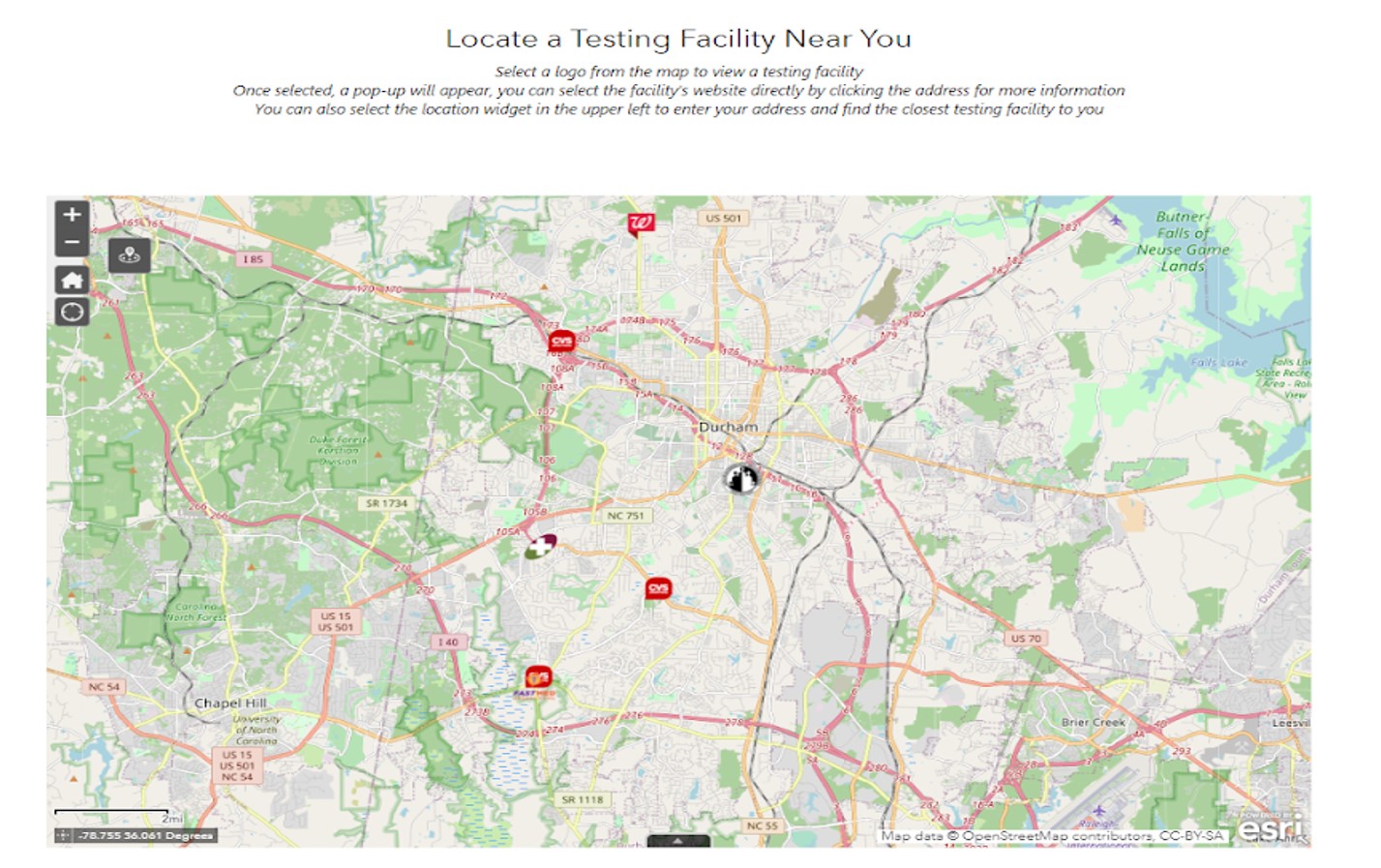
Haha, just kidding! That’s just for white people. This might not make sense if you have never lived in Durham or are not good at reading maps but all the places that have testing facilities are where the white people live. Those big places that don’t have any testing facilities are where most of the population lives but they are the black and brown people. I think it would be interesting to overlay the historic redline maps with the testing facilities… Where my GIS nerds at?
Here is the next graphic on the same page.It is the Durham County Case Count.
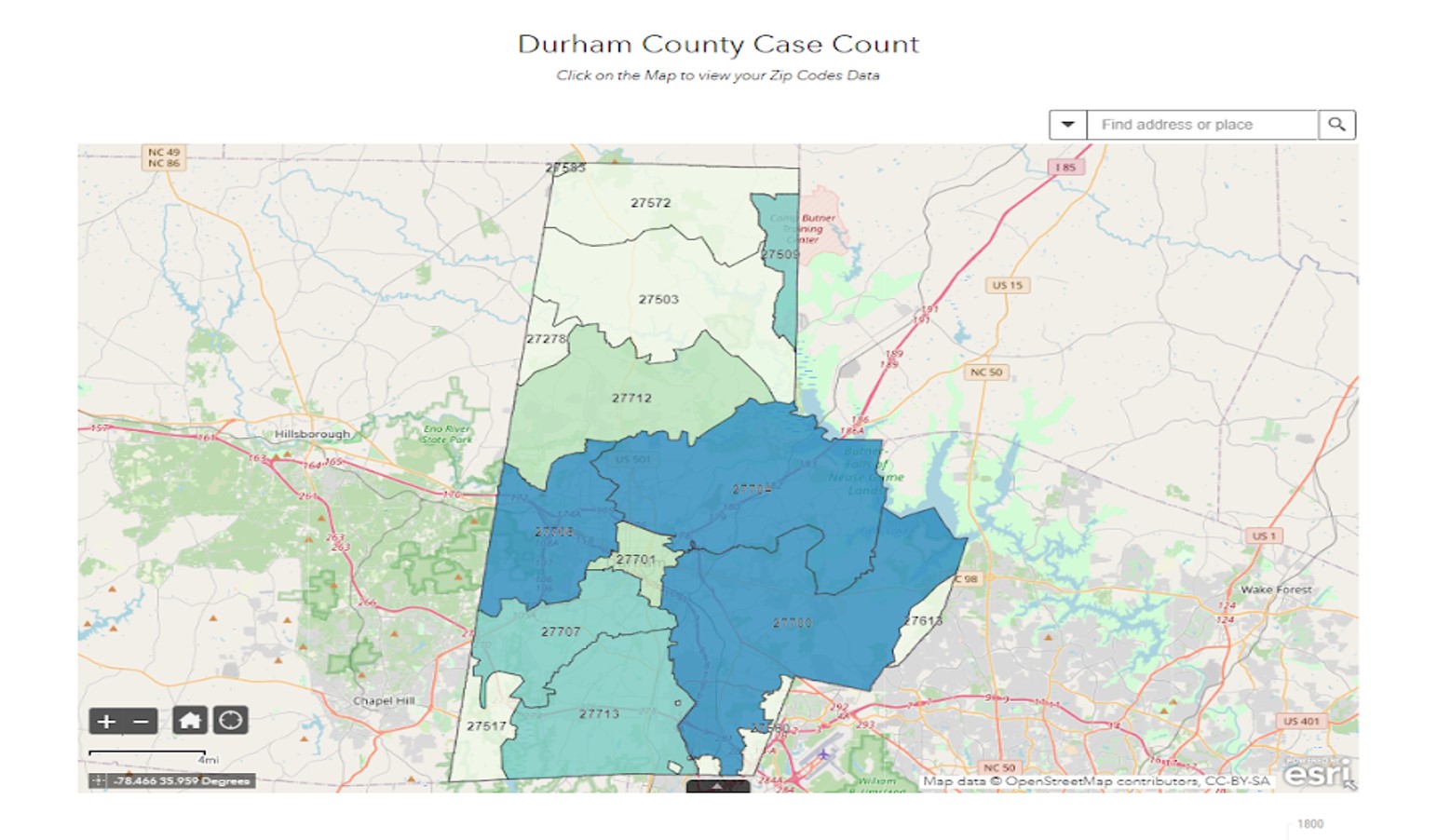
This week 27704 Zip Code has both the highest case count overall and the highest per capita case count. It also has the highest number of black and brown people and (reference previous graphic) no testing facilities. So, despite having no testing facilities it has the highest case count which means these graphics and numbers are likely wildly undercounted and don’t even begin to adequately illustrate the inequities they so glaringly show.
Also telling in the statistics in Durham are the fact that the most cases of COVID-19 in Durham in March were white people. The most cases in April were black people and the most cases in May were LatinX people. As we move along the trajectory of this disease the smaller minorities bear more and more of the health burden (and are less likely to have health insurance to cover the medical care they require). There are some other nuances to this data that are more fully explored on the Durham Health Department’s website like what industries are overwhelmingly represented in the COVID numbers. I just wanted to share some of my reactions to the glaring inequities that I see in a very cursory and not especially informed quick pass of the information available at a glance.
The people in the streets protesting systemic inequity are not just angry about violent cops, they are fed up with the fundamental inequity baked into our entire imperialist way of life and bearing the social burden of supporting the privileged class. Fuck your “Way of Life!” When your privilege comes at someone else’s expense (which, by definition, it does) then defending your way of life becomes indefensible.
Wait, sorry, that seems to be a snippet of a much more involved rant that belongs in a later post or something. For now let’s try to stay focused. Look at the numbers! The numbers don’t lie, much like Shakira’s hips! (If you need, I can explain why that is relevant to this conversation on systemic racism and not just a random aside)
Anyway, I thought I should include one more graphic just for funsies.
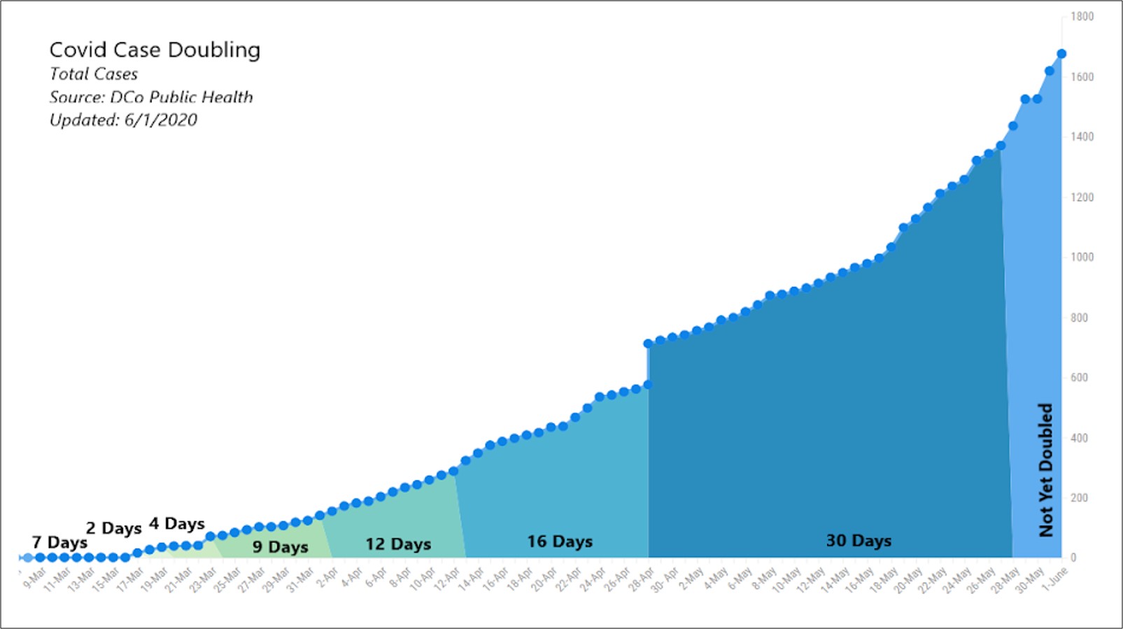
This graphic shows the doubling time for COVID cases in Durham. It is “hopeful” because, technically, we “flattened the curve.” You can see that the doubling time is (was) slowing. It went from 2 to 4 to 9 to 12 to 16 to 30 days. Keep in mind that this is based on incomplete data and our highest case count is in a zip code with no testing facilities and we are easing restrictions on mobility and public gatherings. Its probably fine…
Note: my degree is only in Civil Engineering and I got a C in statistics one time (making sure this is still about me) Could someone help me understand what exponential growth looks like? Is it possible to take the data available and build a model that predicts the future? I feel like there is a pattern here but I’m mostly relying on intuition.
Conclusion: I’m so moved by how we all came together as a nation to flatten the curve and I’m glad everything is about to get “back to normal.” Thanks America for being Great Again! (wipe away tear) I LOVE YOU GUYS!…
Here is a link to Durham, NC Health Department’s ARCGIS page.